Three new free JAMstack themes for IndieWeb blogging!
Announcing Three New Free JAMstack Blogging Themes

Ask anybody on the IndieWeb what they think about blogging, and you'll most likely get a rather passionate, long-winded answer. I'm no different. I started getting into web development over a decade ago with Jekyll and the announcement of Ghost when I was still in high school.
As the years have gone by, I've stayed in this cozy, somewhat obscure niche of JAMstack development, making static site themes and projects that are open source and free for others to use however they like. This is exactly why I founded 🍓 Berry House in the first place, because I believe having your own website is just getting more and important and useful in today's age of corpo-AI slopfests.
After I received a donation yesterday from the lovely BinaryDigit, crediting me for the 11ty theme I made previously called RetroWeird, I realized I needed to get back into making blog themes.
As fun as RetroWeird is visually, I can't imagine it would actually be easy to use as a blog theme, I would imagine there would be a lot of wrestling with it. (Hyperpop is also a fun theme I made as well, but it has similar problems.) And even though it's only been a few months since I've made these themes, I've already learned a lot since then. Sometimes, like actual property, it is easier to start from scratch than try to do renovations.
I needed to return to form. Start from scratch and take what I've learned over the past few months and make the best possible themes I could for people that want to get onto the IndieWeb.
With these themes, or any themes for Hugo, 11ty, Jekyll, Pelican, etc. All you need is a git repository, whether on GitLab or Codeberg or elsewhere, hook it up to a service like Netlify or Vercel, and you have your own blog for free. The only thing that'll cost is a domain name. No databases, no monthly fees, no limitations to customization. You write your blog posts in plain-text markdown files however you like, and that's it.
With all that out of the way, let's actually get to the themes!
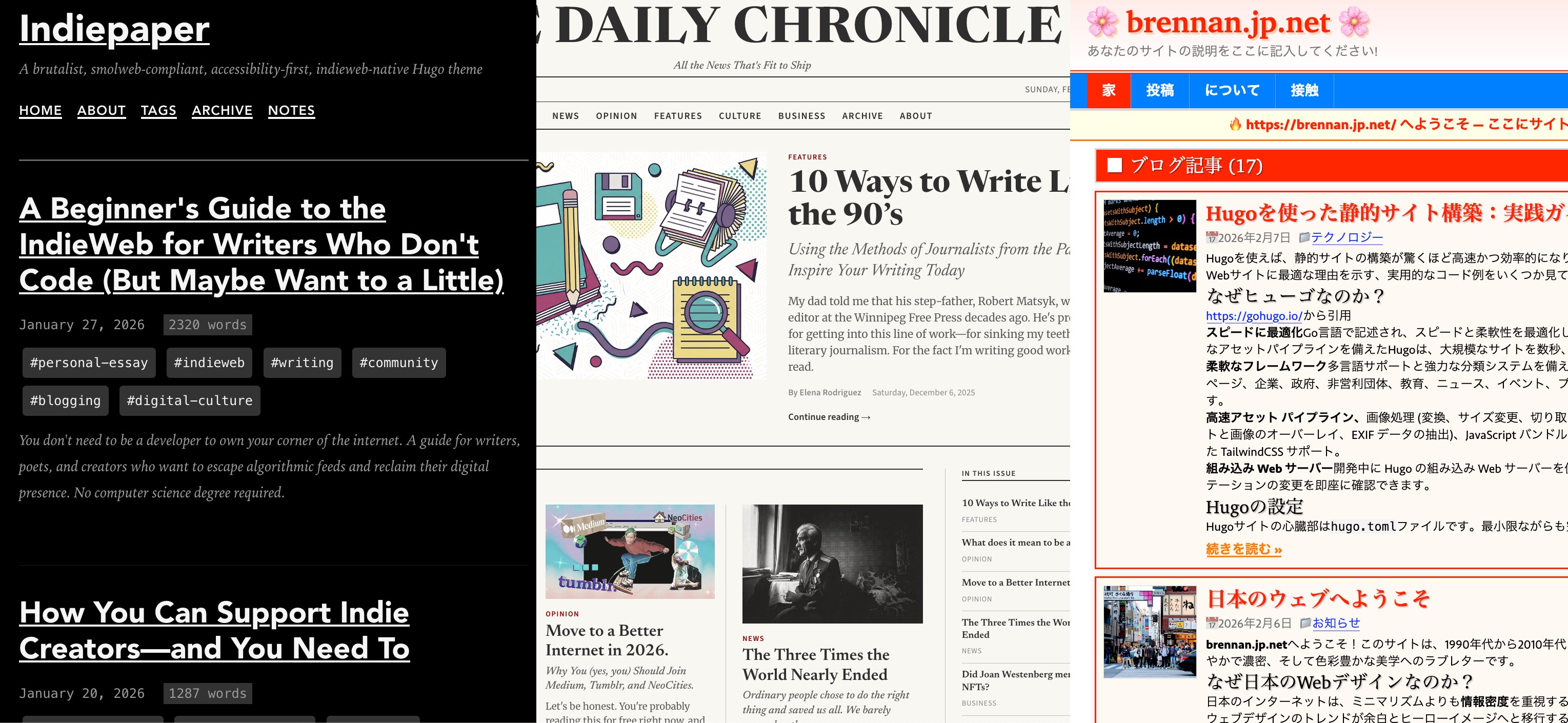
📰 Indiepaper
Platform: Hugo
Philosophy: Smolweb compliance meets brutalist design
Repository: github.com/brennanbrown/indiepaper
Demo: indiepaper.netlify.app
This is the first theme I started on, and originally was going to be the only theme I was going to be making before procrastination and scope creep got the better of me. Indiepaper takes inspiration from the brutalist web design movement with a greyscale aesthetic.
Indiepaper has microformats2 support built in, h-card for author identity, h-entry for blog posts, h-feed for listings, and h-cite for webmentions.
The purpose of Indiepaper is to not only be IndieWeb friendly, but also smolweb compliant. This means that it is, well, small! There's no embedded fonts or JavaScript or CSS frameworks. It's designed to be as minimal as possible, what you see is what you get. This means it is easy for people to customize it to their hearts content without breaking anything, because there's so little to break!
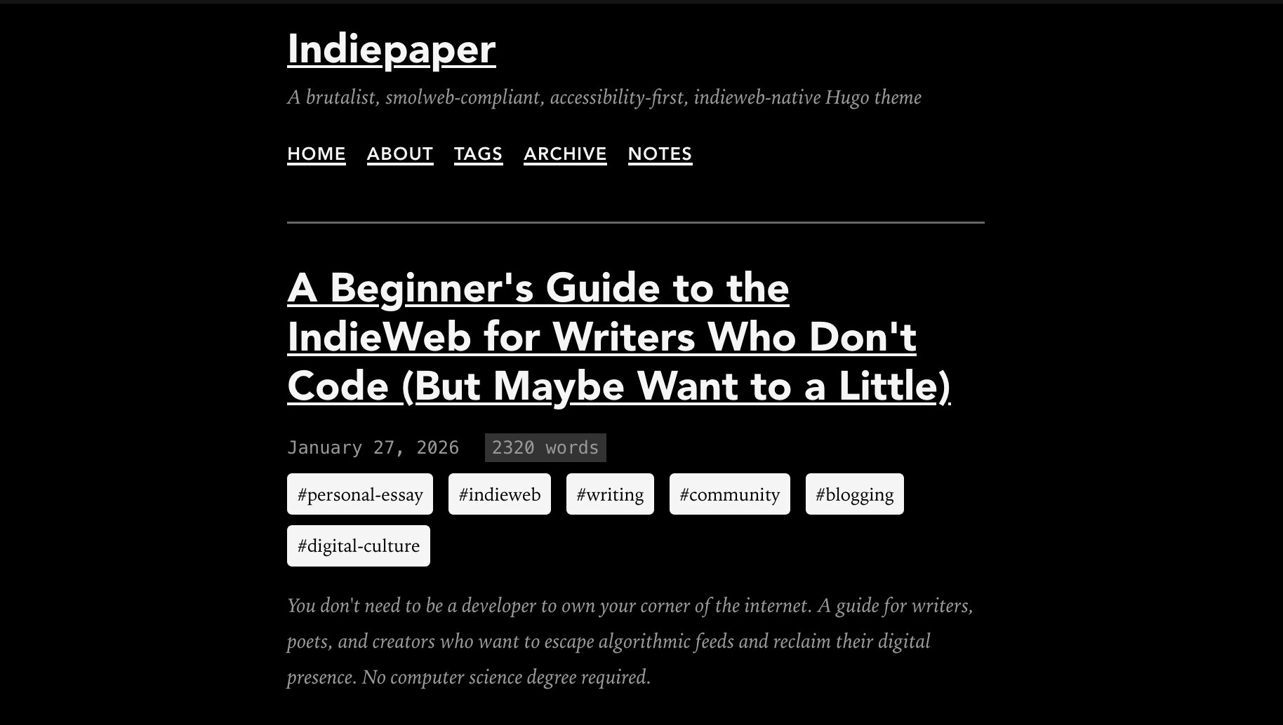
Typography Without External Dependencies
I've been someone who relied on Google Fonts for a long while because I was only aware of a handful of universally-compatible fonts (none of which are rather attractive), and while I do love the service still, I found out about Modern Font Stacks which will give you an array of typefaces based on classification that are available for every widely-used system: Windows, MacOS, Ubuntu, iOS, and Android.
As somebody who also loves Garamond, I decided to use Old Style fonts for the body, and Geometric Humanist fonts for the headers. I believe this lends itself to both easy readability and a more modern look. The body text uses old-style serifs like Iowan Old Style and Palatino Linotype, while headers use geometric humanist sans-serifs like Avenir, Montserrat, and Corbel. Code blocks use modern monospace fonts including ui-monospace, Cascadia Code, and Source Code Pro.
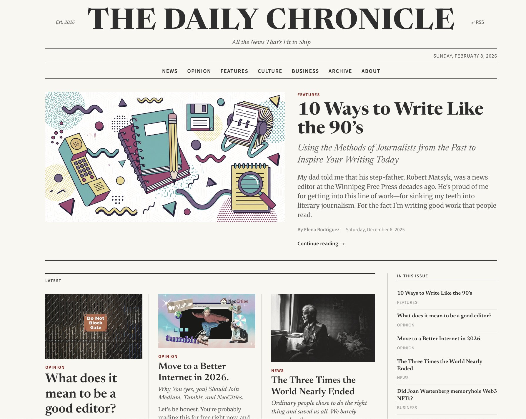
🗞️ Newsprint
Platform: Eleventy (11ty)
Philosophy: Newsletter-first publication meets classic newspaper design
Repository: github.com/brennanbrown/newsprint
Demo: newsprint.netlify.app
While making Indiepaper, I realized how cool it would be to have a blog that actually looked like a newspaper. I wanted to create something §skeuomorphic, omg.lol's news and updates actually already done this really well in a simple way! And I found this helpful codepen snippet created by Silke V. which helped me with the initial design phase.
Not only did I want a newspaper look, but I figured the theme should also embody other newspaper ideals, such as having a thoughtfully designed RSS so it can be delivered as a newspaper as well, right? (And really good print styles to boot!)
I did this by having full-content feeds using email-safe HTML, plus category-specific feeds for News, Opinion, Features, Culture, and Business. Each article can be categorized, and readers can subscribe to specific topics they care about. The main feed is available at /feed.xml, with individual category feeds at /feed/news.xml, /feed/opinion.xml, and so on.
Newsprint has multi-column layouts, a traditional masthead, drop caps, pull quotes, ruled lines, and a sepia palette. The sidebar features follow links for configured social platforms, and there's built-in donation support through Ko-fi, Patreon, or any platform you prefer. The donation section can be easily hidden if you don't want to monetize.
Articles use a front matter system including title, subtitle (deck), publication date, author, category, featured status for homepage placement, excerpt for RSS and meta descriptions, and optional featured images with captions. The homepage features a dedicated featured article section and a grid of the latest nine articles, excluding the featured one.
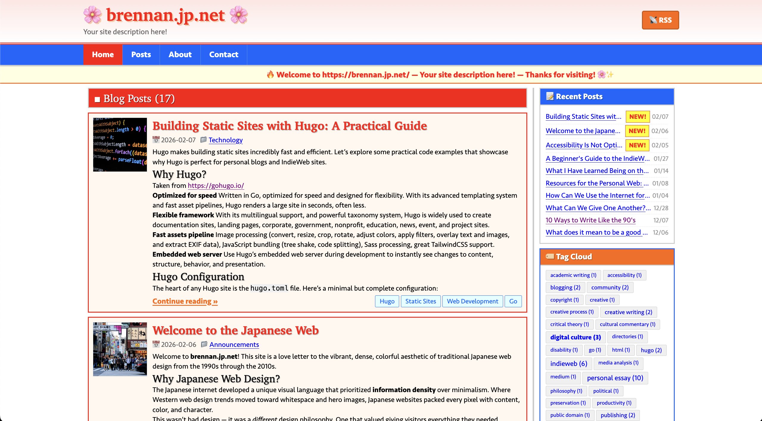
🎋 brennan.jp.net
Platform: Hugo
Philosophy: Japanese web design with vibrant colours and dense information layout while remaining accessible and modern
Repository: github.com/brennanbrown/brennan.jp.net
Demo: brennan.jp.net
Finally, I want to talk about the silly theme I decided to create. When I got started on omg.lol I realized I wanted a fun, short domain. I decided to go looking for my first name with whatever TLD was available. And oh my god, there are SO many ways to end a website now! .taxi, .pizza, .skins, there are so many alternatives to the boring .com or .org we've come accustomed to.
I ended up settling for brennan.day, but I also bought brennan.page and brennan.cafe, since they were both cheap first-year purchases and short, and I'm currently using the other two for homeservers I've been neglecting. (It's so fun to procrastinate side projects with other side projects!)
When I was searching, though, one that caught my eye was brennan.jp.net, not only was this really inexpensive (less than $8 for registration and future yearly renewals) but it was also short and simple.
And then I had another thought, *Japanese web design sure is interesting, huh?
I wanted to recreate the compact, text-heavy, colourful aesthetic of traditional Japanese web design from the 1990s through 2010s, while maintaining modern accessibility and performance standards.
A Brief History of Japanese Web Design
Many have already written about this topic with much more knowledge and research than I have, but digging into it, I found the phenomenon fascinating. As one Reddit user succinctly put it: "Japan, living in the year 2000 since 1985." The essence is that a lot of Japanese sites still retain a classic web 1.0 aesthetic that isn't exactly what the web 1.0 aesthetic looked like here in the West. While there is a simplicity, there is also a density, a wide array of different rows and columns displaying diverse information to the user all at once.
Before the iPhone changed mobile web design globally, Japan hadkeitai culture. As early as 1999, NTT DoCoMo launched i-mode, bringing email and web browsing to compact mobile phones years before the rest of the world caught up. By 2000, Japanese phones had cameras, and by 2001, they had 3G. The J-SH04 was photo messaging before most people had even heard of a smartphone.
When the Western world started simplifying web design for the iPhone around 2007, Japanese designers didn't feel the same pressure since they'd already optimized for mobile screens a decade earlier. Those text-heavy, densely packed layouts were designed to be viewed on tiny keitai screens. What looks overwhelming on a desktop was crafted for one-handed phone navigation on crowded Tokyo trains.
There's also the cultural expectation of passivity in information presentation, Japanese UX architects have noted users expect information to be presented to them comprehensively, like a detailed brochure, rather than having to dig through minimalist menus to find what they need.
Detail and thoroughness are valued over the stark simplicity of minimalism. The bright, clashing colors within the neon-lit streets of Tokyo's shopping districts, where every available space is used efficiently.
Japanese language also has thousands of CJK characters, which means far fewer web font options compared to Latin alphabets. This is why so many Japanese sites use text embedded in images, giving designers typographic freedom which web fonts don't have.
A fascinating quantitative study by Sabrina's Space ran over 2,600 images of popular websites through clustering and found that Japanese sites distinctly avoid dark, minimalist designs, clustering instead around lighter colors and higher visual density. This pattern doesn't appear in other countries, even neighbouring nations with similar writing systems.
...Back to the Theme
There's a nostalgic charm with dense, newspaper-style layouts packed with information, bright and vibrant colors with thick borders, and classic web elements like webrings, 88x31 badges, and visitor counters (using local storage for fun, not actual analytics). Despite its retro appearance, it maintains modern accessibility with proper semantic HTML, keyboard navigation, high contrast, and screen reader compatibility.
The theme is designed to be accessible to non-technical users. You can customize colors through simple configuration in hugo.toml, change the primary and secondary color schemes with hex codes, toggle the sidebar on or off, and add custom CSS without touching the core theme files.
Getting Started with Any Theme
All three themes are designed for accessible deployment. You can host them for free on Netlify, GitHub Pages, Vercel, or Cloudflare Pages. The only cost is a domain name (which can be as cheap as $5/year on Porkbun).
Like all my work, they're released under the AGPL* license, meaning you can use them however you like, modify them, and even use them for commercial projects.
Note: The themes also include proper SEO configuration with noindex options for demo sites (remember to turn this off when you launch!), social media meta tags, and optimized feeds for discoverability.
Why I Made Them
I'd like to think these themes represent three different approaches to personal publishing:
- Indiepaper for those who value minimalism, speed, and accessibility above all else
- Newsprint for those who want to run a serious publication with professional aesthetics
- brennan.jp.net for those who miss the creative, playful web of the past
I care about content ownership, web standards, and the IndieWeb principles of controlling your own digital identity. These themes are fast, accessible, and designed to last. No framework churn, no dependencies, just HTML, CSS, and markdown files.
Whether you're a writer, journalist, developer, or just someone who wants a corner of the internet to call your own, these themes offer a foundation for building something meaningful. Just you, your words, and your website.
Happy blogging!


Comments
To comment, please sign in with your website:
How it works: Your website needs to support IndieAuth. GitHub profiles work out of the box. You can also use IndieAuth.com to authenticate via GitLab, Codeberg, email, or PGP. Setup instructions.
Signed in as:
No comments yet. Be the first to share your thoughts!