Building brennan.day Part One: Design, Rainbows, and Accessibility

There's nothing I love more than personal sites. I spend hours exploring personalsit.es and neocities.org, looking for inspiration.
During COVID-19 lockdown over half a decade ago, I took a coding bootcamp now known as InceptionU and hunkered down in isolation, getting serious about my web development again. I created a Jekyll theme called Enjoyment Work which had a lot of features I wanted in a site. Here are some of my notes on the project at the time. I was thinking about digital garden functionality with actual marginalia, blogging with inline double-bracket linking support, among other features.
But build times were painfully slow. Partly because it was Jekyll and partly because there was bad code hygiene in the project. At the very least, it's a cool proof-of-concept.
As I've matured, there are a few hard-earned lessons I've come to accept. First is that you need to start where you are, not where you want to be. Second is that you need to design what you will use, not what you want to use.
It was really easy for me to get caught up in the dreamy aesthetics of personal knowledge management systems, the fantasy of optically being knowledgeable rather than the knowledge itself. What ends up happening is you spend more time tinkering with the system than actually using it.
This site, brennan.day, is the result of years of dev work and figuring myself out. I've done enough practice not only to make a site I actually enjoy, but to actually use it daily with no friction.
How It's Made: The Colophon
First, an aside: what is a colophon? Traditionally, a colophon is a handy description at the end of a book detailing production notes. You know, ypefaces used, paper quality, printing method, etc. On the web, it's evolved into a "how it's made" page that explains the technology and philosophy behind a site.
While I already do have a page dedicated to this, I thought it might be fun to get into the weeds about specific technicalities and design choices I've made.
Let's begin with the tech stack of the site:
- Static Site Generator: Eleventy v2.0+
- Template Engine: Nunjucks for layouts, Markdown for content
- Styling: No CSS frameworks, vanilla CSS with a Gruvbox-inspired color scheme
- Hosting: Netlify (though it could be anywhere)
- Domain: brennan.day via Porkbun
- Search: Pagefind for static, client-side search
I've been using Jekyll since I was in high school ten years ago, but it's become less and less of a logical choice for projects.
Why Eleventy instead? Primarily because it's JavaScript-based, which means you can leverage the npm ecosystem. It's zero-config by default but incredibly configurable when needed. It's also rather opinionless about how your content should be structured, which can be too open-ended for some.
// The entire Eleventy configuration is under 400 lines
module.exports = function(eleventyConfig) {
  eleventyConfig.addPlugin(pluginRss);
  eleventyConfig.addPlugin(syntaxHighlight);
  // ... a few more plugins and filters
  return {
    templateFormats: ["md", "njk", "html"],
    dir: { input: "src", output: "_site" }
  };
};
There are no Ruby dependencies leading to complex build chains. This results in my build times going from minutes in Jekyll to single-digit seconds.
My local development server starts instantly with npm start, and the production build with npm run build generates the complete site in under 10 seconds on my machine.
{
  "scripts": {
    "start": "eleventy --serve",
    "build": "eleventy && npx pagefind --site _site",
    "clean": "rimraf .eleventy-cache _site"
  }
}
Custom CSS: No Frameworks
Let's start with some design talk. This probably sounds insane, I decided to write the entire CSS for this site from scratch. I find that every CSS framework comes with opinions and bloat. Bootstrap wants you to think in grids and Tailwind wants you to memorize utility classes.
I like to think this helps perfomance and learning. But, really, it's probably just a lot of neurotic reinvention of the wheel.
The stylesheet is currently over 3,500 lines lomg, organized with a table of contents. It starts with CSS custom properties (variables), establishes a design system, then builds from base styles up to components.
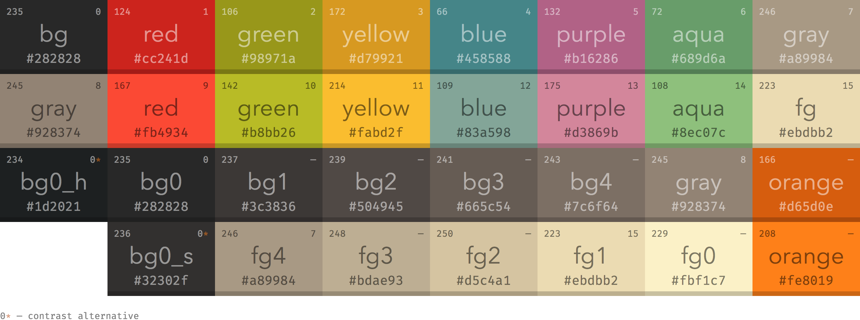
The color palette is based on Gruvbox, a popular colorscheme designed for people who spend a long time eying the terminal. Why did I choose Gruvbox? As per the original designer:
Designed as a bright theme with pastel 'retro groove' colors and light/dark mode switching in the way of solarized. The main focus when developing gruvbox is to keep colors easily distinguishable, contrast enough and still pleasant for the eyes.
:root {
  /* Light mode */
  --bg: #fbf1c7;
  --fg: #3c3836;
  --accent-primary: #cc241d;

  /* Dark mode overrides */
  &.dark-mode {
    --bg: #282828;
    --fg: #ebdbb2;
    --accent-primary: #fb4934;
  }
}
The nice thing with this pallete is that light mode text exceeds WCAG AA standards, dark mode is even better for users with light sensitivity, links are clearly distinguished from regular text, and focus states use high-contrast colors.
On Rainbows
If you haven't noticed, there are rainbows everywhere.
Why rainbows? Well, to start, I just love rainbows. Their aesthetic encourages individuality and acceptance. In design, they are related to hope, relief after difficult times, and new beginnings, and are used to represent diversity and joy. All of which are values that I want my personal website should embody.
To give myself more of a serious rationale, Aarron Walter's hierarchy of user needs states pleasure and delight sit at the top of the pyramid, achievable only after foundational needs like functionality and usability are met. My site works first, then it delights. Surprise and delight in design involves unexpected elements that bring joy or amusement.
I like to think the rainbow accents don't interfere with readability or navigation, but rather enhance the experience by creating positive emotions that ensure visitors stick around.
/* Navigation rainbow colors */
--nav-red: #cc241d;
--nav-orange: #d65d0e;
--nav-yellow: #b57614;
--nav-green: #79740e;
--nav-blue: #076678;
--nav-indigo: #458588;
--nav-violet: #b16286;
These colors cycle through navigation links, footer links, and the card design on the slash-pages and accounts page. Each navigation item gets its own color from the rainbow sequence.
The /slash-pages and /accounts pages use the same card-based grid system with rainbow accents, with each card getting an accent colour from the rainbow sequence:
.verify-card {
  --card-accent: var(--nav-red);
  background: var(--bg-alt);
  border: 2px solid var(--border);
  border-radius: 8px;
  padding: 1.5rem;
}

.verify-card:nth-child(7n + 1) { --card-accent: var(--nav-red); }
.verify-card:nth-child(7n + 2) { --card-accent: var(--nav-orange); }
/* ...and so on through the rainbow */
The /slash-pages page is inspired by the slash pages movement, a collection of useful, human-focused pages. A site map with personality. Each link includes a brief description and an icon, making navigation intuitive.
The /accounts page is a verified public list of all theaccounts I control across the web. This is part of the IndieWeb approach to identity, instead of trusting a platform's verification system, you verify by linking from your own domain.
Next, the site title in the top right gets special treatment with an animated rainbow that flows on hover on desktop:
.weblog-title a:hover {
  animation: rainbow-wave 1.5s ease-in-out infinite;
}
The navigation stays fixed at the top as you scroll, with a rainbow progress bar showing how far you've read down the page:
.site-header {
  position: sticky;
  top: 0;
  --scroll-progress: 0;
}

.site-header::after {
  background: linear-gradient(90deg,
    var(--nav-red), var(--nav-orange), var(--nav-yellow),
    var(--nav-green), var(--nav-blue), var(--nav-indigo), var(--nav-violet));
  transform: scaleX(var(--scroll-progress));
}
The progress value is updated via JavaScript as you scroll, creating a visual indicator of reading progress. I like to think it's useful for the reading experience on longer articles.
Now, let's get into some other CSS functionality.
Automatic Heading Anchors
Every heading gets an anchor link automatically, but they're hidden until you hover:
:h1 .header-anchor::after { content: " #"; }
:h2 .header-anchor::after { content: " ##"; }

.header-anchor {
  opacity: 0;
  transition: opacity 0.2s ease;
}

h1:hover .header-anchor,
h2:hover .header-anchor {
  opacity: 1;
}
This keeps the page clean while still making it easy to link to specific sections. The number of # symbols matches the heading level for visual clarity.
External Links: Clear and Simple
External links, like to https://omg.lol, get a small arrow indicator (➚) to show they leave the site:
a[href^="http://"]:not([href*="brennan.day"]):not(.no-external-icon)::after,
a[href^="https://"]:not([href*="brennan.day"]):not(.no-external-icon)::after {
  content: "➚";
  font-size: 0.75em;
  margin-left: 0.2em;
  vertical-align: super;
}
The not(.no-external-icon) exception lets me disable the arrow on specific links where it would be redundant (like badge images or my book covers).
Accessibility: Building for Everyone
Ever since I began web design, I've already tried to make sure accessibility (a11y) has been foundational rather than an afterthought. It improves the experience for everyone, not just those with disabilities.
And this site aims to be usable by everyone, regardless of ability, device, or circumstance. WCAG 2.1 AA compliance is the minimum standard, but I'm always pushing for better.
The site starts with proper semantic structure:
<!-- Skip link for keyboard navigation -->
<a href="#main-content" id="skip-to-content">Skip to main content</a>

<!-- Proper landmarks -->
<main id="main-content" aria-label="Main content">
<section aria-label="Posting activity">
<footer role="contentinfo">
Screen reader users can jump between sections, understand the page structure, and navigate efficiently. Every interactive element has proper ARIA labels and roles.
There are many features that work without a mouse, such as keyboard navigation, focus indicators, and reduced motion support.
/* Clear focus indicators */
a:focus-visible,
button:focus-visible {
  outline: 2px solid var(--accent-primary);
  outline-offset: 2px;
}
Respecting user preferences is essential. The site detects and honours prefers-reduced-motion:
@media (prefers-reduced-motion: reduce) {
  *,
  *::before,
  *::after {
    animation-duration: 0.01ms !important;
    animation-iteration-count: 1 !important;
    transition-duration: 0.01ms !important;
    scroll-behavior: auto !important;
  }
}
If you've disabled animations in your system preferences, this site won't force them on you. The rainbow wave effect, scroll animations, and hover transitions all respect this setting.
For screen readers, images have meaningful alt-text (that can be viewed by hovering over an image on desktop), icons use aria-hidden="true" when decorative, and forms have proper labels and descriptions. Screen reader-only text is available when needed:
.sr-only {
  position: absolute;
  width: 1px;
  height: 1px;
  /* Hidden visually, available to screen readers */
}
Accessibility is continuous improvement. That means regular testing with screen readers (VoiceOver, NVDA), keyboard-only navigation audits, color contrast verification with tools, and user testing with people with disabilities.
The goal is genuine usability, not some checklist of compliance. A site that isn't accessible has simply failed.
Conclusion
Thank you for reading! I've somehow made a project so complex that it requires me to break this post into multiple parts. Tune in next time for a look at how I support IndieWeb practices, my progressive use of JavaScript, and spoilers for the several easter eggs I have hidden around the site. Cheers!